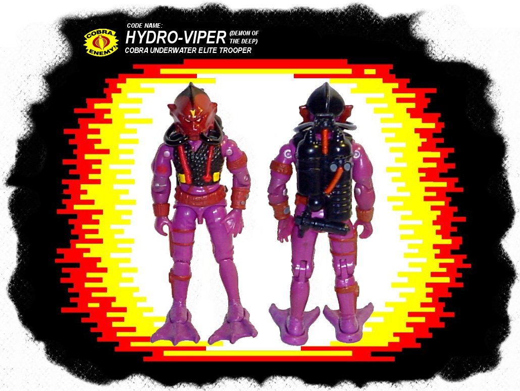
Hydro-Viper 1988
This one is a prime example of how the lack of a paint application can absolutely kill a figure. While the colors on this figure were pretty atrocious on their own, the loss of the black vest left nothing to effectively tone down all that violet and we are left with something that resembles grape yogurt. Another difference was the red feet and flippers, these appear purple in the card art but the entire lower half of the art is discolored due to the underwater effect, making it hard to be sure of colors. The pre-production figure supports the purple flipper theory but shows the feet red which doesn't look good and didn't make sense. The red feet on the prototype were probably from a stage in production when they decided to change the flippers to red, but hadn't gotten them produced yet. I decided to paint the feet purple too since that's how it most appears on the card art, and it just plain looked bad with red feet and purple flippers. The red was also a bit too "red" on the figure, and needed more of a brownish tint, only the hoses on the vest should be bright red.
Changes:
1. The missing black paint application was added to the vest.
2. A more brownish tint of red was used on the helmet and all red body parts except the hoses. (This is more noticeable in person than in the pictures.)
3. Gray paint app was added to the gauge lenses on the wristband and oxygen tanks.
4. The feet were painted purple to match the figures legs and flippers.
5. Swimming flippers painted purple as shown on the card art and pre-production prototype figure.
6. Ribbed hoses on oxygen tanks painted red to match hoses on the vest.
